Skew-Ts aren’t the sort of thing you learn about in ground school, but I’m quite outspoken about how important they are to understanding the weather. They’re very easy to get online, they are understandable, and they form a playbook for the weather ahead. In a sense, reading a METAR or TAF report is like looking at the warning indicator on a car dashboard, while looking at the Skew-T is opening up the hood and finding the answers.
Back in October we presented an introductory article on these charts. But we realize unusual and complex topics like this don’t make much sense the first time around. After getting a pointed note from a reader saying we need to either write an article with the basics, or quit writing about Skew-Ts altogether, we think that a back-to-basics approach is just what’s needed to help the subject sink in a little better. Trust me, these charts aren’t all that complicated and you can understand and make use of these charts.
Let’s just start with a quick definition. The Skew-T is a nickname for the Skew-T log p diagram. This is simply a depiction of measurements with respect to height. It’s made for a single station at a single date and time, and is normally available twice a day. It’s also called a “sounding” or a “thermodynamic diagram.” Glider enthusiasts and some balloon operators love the Skew-T, but most general aviation and commercial pilots have never heard of them. Stick with us as we undertake to change that.
Temperature and Pressure
As a pilot, one of the things you’re probably most familiar with is how much colder it gets with height. After lifting off from Phoenix where it’s 115 degrees F in July, it’s quite normal to climb up to 30,000 feet and find yourself in frigid -35-degree conditions. If you’ve ever contemplated why this is so, you’re already trying to understand the atmosphere and are certainly ahead of the game.
To understand this better we need to look at how air is distributed in the atmosphere. Like all forms of matter, molecules and atoms of air are attracted to Earth by its gravitational pull. However air is also compressible, so we get something like an arena-sized ball pit filled with squishy balls, like the kind you might get from a claw machine at the mall. Most of the squishy balls are packed tightly against the floor. It’s impossible to tunnel your way through. But up on top it’s different. Here you find a very loose distribution of balls layered on top, and it’s easy to push them around.
The balls near the bottom are heavily compressed because of the weight of all the other balls above, while those balls near the top are much less compressed. As a result we see pressure (which is simply the weight of all the balls on top) being quite high near the ground and gradually decreasing with height, and pressure is a function of the balls lying above. A bathroom scale on the ground measuring the weight of all the balls on top is analogous to a barometer, which measures the weight or pressure of the air pressing down on it.
The atmosphere works the same way: pressure is high at the surface, decreasing gradually with height. We also see a decrease in temperature with height. The surface layers are warmed by the continuous heat from the Earth’s surface, as well has heating from air under compression.
But at high altitudes we find mostly low-density air with no source of heat. There’s very little matter here to conduct heat, and radiation passes right through without contributing anything. The big exception is the ozone layer, as ozone does capture radiation, warming the stratosphere, but that’s not important (yet) to aviation. Some heat does arrive regularly in the upper levels due to convection or advection, but it’s still brutally cold. A typical atmospheric temperature profile decreases from near 60 degrees F at sea level to well below -40 degrees at the top of the troposphere.
Time to Jump In
At each of the bases where I worked as an Air Force forecaster, I always ended up training new forecasters. When it came to complicated tasks, I always had the most success by having the new guys jump right in, with me alongside navigating the way. It always seems to work better than boring people with introductory material and abstractions. So that’s what we’ll do for the Skew-T. Let’s give it a go.
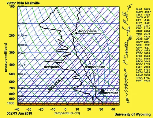
We’ll begin by looking at a typical Skew-T chart on a quiet weather day, as shown on the next page Looks messy, doesn’t it? This is actually a chart for Nashville on the weekend of the Twin Cessna Flyer convention of June 2018. Maybe some of you were there! Like most Skew-T’s, this chart is based on observed data. At the time there wasn’t much weather going on, just boring early summer heat and lots of cumulus.
The data was collected by a balloon-launched radiosonde at the National Weather Service office, located about ten miles northeast of the city. The data is radioed from the airborne device to a telemetry station at the office, where the measurements are extracted, coded, and sent out over the network. Sometimes Skew-T’s are constructed using computer model data, but those normally aren’t the ones you find when you’re just browsing the web.
To explain what we’re looking at, this is a diagram of temperature (horizontal axis) with respect to height (vertical axis). The bottom of the chart is near sea level, while the top of the diagram is at about 54,000 feet MSL. Pretty easy, isn’t it? Whenever you see these diagrams, simply visualize the bottom of the chart as always being near the ground, and the top of the chart as the bottom of the stratosphere, and it will always make sense.
So what are the left and right sides of the chart? The left side of the graph space represents cold conditions, while the right side is used for warm conditions. It’s that simple. For measurements of moisture, the left side is used for dry conditions and the right side for humid conditions.
Understanding Height
An important part of Skew-Ts is understanding the height system. This is probably the biggest hurdle, because in meteorology we don’t do things in feet. Height on the chart is indicated in units of pressure, almost always millibars (hectopascals). So when you see a height (pressure) of 500 mb, if you brought a barometer to this level it would read 500 mb (14.76 inches of mercury). It’s essential to memorize the approximate heights of a few key altitudes. As you use the Skew-T, these memorizations will stick.
The first to be familiar with is 1000 mb. This is pretty close to sea level, usually about 300 feet MSL in quiet weather. Data that’s close to this always represents conditions close to the ground (assuming the ground is near sea level), and you can use information here to compare with surface data and keep track of fronts.
The next level to memorize is 500 mb. This is normally found around 18,000 feet MSL, but often varies according to the temperature profile. You can not only see conditions near the cruise altitude of many twin-engine planes, you can also get an idea of the dominant prevailing wind. Since this is around the center of mass in the troposphere, wind motion is not influenced very much by convergence and divergence, so those processes are mostly filtered out and we’re seeing the kinds of motion that are really going on.
Two more useful levels to know are the “twins”: 300 mb and 200 mb, which correspond to about 30,000 feet and 39,000 feet. Both of them put you up in the top of the troposphere, right within the jet stream. You’ll often find the tropopause near this level, where the temperature stops falling with height or even warms. You can probably ignore anything happening above the tropopause as that’s the stratosphere and conditions there won’t have much bearing on the day-to-day weather.
Another useful level is 850 mb, which is around 5000 feet. This area of the chart gives you low-level conditions just above the surface. This is especially helpful during the morning hours when the surface is dominated by radiational cooling; at 850 mb you get a sense of the conditions that will affect the surface as the day goes on. If strong winds are at 850 mb and morning surface winds are calm, the strong 850 mb winds will probably mix down later. Likewise unusually warm 850 mb conditions indicate that strong heating will take place as the morning progresses.
If you’ve got room for one more level to remember, try 700 mb. This is found around 10,000 feet MSL. This is a common elevation to find icing, dendritic growth zones that produce snow, and the tops of air masses.
The important thing is not what happens at those levels, but the fact you can now “guesstimate” altitudes on the SKEW-T chart. When I first started working with them I often referred to the height scale that comes with paper charts, but eventually I found it more convenient to just interpolate using memorized values. For example, 600 mb puts you midway between 500 and 700 mb, which you now know are around 18,000 and 10,000 feet. So that yields a ballpark altitude of 14,000 feet. Juggling these altitudes helps put the things you see into context right away, and you can match unusual things you see with what you see on radar, METARs, and in PIREPs.
Remember these altitudes are starting estimates and actually depend on the density of the atmosphere. When conditions are cold (denser air) the actual altitudes will be about 5-10% lower and vice versa when it’s warmer, but that’s good enough for getting a good idea how the atmosphere is structured. When you need exact altitudes you can refer to Skew-T sites that solve the atmosphere hydrostatically; they provide text output that lists out the heights in a big table like that shown above.
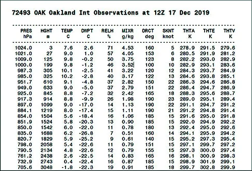
Chart-Reading Skills
Now it’s time to look at some data. Back on the Skew-T chart, you can see two clearly defined vertical lines. These represent the observed values measured by the radiosonde at different pressure levels. Temperature is always used for the right-hand line, while dewpoint is indicated by the left-side line. Sometimes the dewpoint data is missing, so when a single line is used, that always represents temperature.
So looking at the temperature line on the right side, we see it starts out toward the right near the ground (Point A), which represents warm surface conditions near sea level. As we climb, as the pressure drops, the temperature moves left, indicating conditions getting colder.
There’s one catch to all this: you might be used to graphs where all of the grid lines are horizontal and vertical. That’s not the case with the Skew-T. The vertical lines representing temperature, the isotherms, actually slope up and to the right, which is the origin of the name “Skew-T.”
It might sound like this complicates things, but it’s a clever trick because it makes important temperature gradients really stand out. Without this, the temperature lines would always lean at a steep angle up with height and to the left (since temperature cools sharply with height) and the charts would always have the same appearance. By shifting those background temperature lines to a 45-degree angle, we force our temperature plot to stand a lot more vertically, and we can see the shapes and characteristics more readily.
So in the example shown here, we can see that the temperature starts at 30 degrees C near the surface and falls rapidly. By the time we reach the 500 mb level (marked on the left side)—about 18,000 feet—we can see the temperature has fallen to about -8 (Point B).
If you didn’t see how we got that, just look where the temperature line crosses the 500 mb level. Read it against the temperature grid by using your finger to move down and leftward along the isotherms until you reach the scale (Point C). This indicates the point is a little to the right of the -10°C isotherm. Don’t use the purple lines, which are mixing ratio lines and used for something different.
Now try reading the temperature at the tropopause (Point D). We see that’s at 190 mb, which is about 40,000 feet. We trace the isotherm down and to the left (Point E), and—uh oh, we’ve gone off the scale. That’s okay. By counting isotherms we can see the temperature is about -56 degrees C.
A very important feature is an inversion in the lower part of the chart (Point F). This is a part of the chart where the slope of the temperature line does something strange: move up and to the right. This indicates a layer where there is no cooling with height. In some cases the temperature even warms with height. This inversion, by the way, extends from about 7000 to 9000 feet MSL.
The Wind Scale
You’ll also notice a handy wind scale on the right side, showing the distribution of wind with height. The shaft always points into the wind. Each long barb represents 10 knots of wind, each short one five knots, and triangular pennants indicate 50 knots. So in our example the winds are mostly out of the north, with the strongest winds showing 50 knots at the 600-700 mb layer. This is at about 10 to 15,000 feet MSL.
Using this wind scale, you can spot immediately whether a strong jet stream exists, without having to turn to multiple charts. This also reveals weird distributions of wind speeds, as well as unusually high jet streams like subtropical jets which sometimes don’t show up on conventional upper-air charts. A layer showing a very strong increase in speed and direction is an excellent sign clear air turbulence can be expected here.
Next Up
In the next issue we’ll look at some examples of real world Skew-Ts, using the dates and places of noteworthy aviation accidents. We’ll go over the hazards and show you some features to look for. I can promise you it will be interesting and educational.
Until then, I encourage you to seek out a source of Skew-Ts on the Internet and get familiar with them. I recommend one of my favorite sites, weather.cod.edu, under Weather Analysis Tools, then Analysis Data, then Upper Air Soundings. Another great source is the University of Wyoming, weather.uwyo.edu/upperair under the Soundings menu.


Tim,
I find the following web site helpful for Skew T Log-P:
https://rucsoundings.noaa.gov/gwt/
It produces a plot for any location with a Metar based on models you can choose. It also will plot the soundings. It is interactive.
Bob Haller
There is a great iOS app … SkewTLogPro … that allows you to generate a chart for any location, over a series of time, and along a route of flight, using interpolated values. Very helpful to visualize how conditions will change over time, and along a route.
I don’t see points A-F on the graph.
So how does the Skew-T help with forecasting weather later in the day or over the next day or two? Not sure I see the benefit unless I’m hopping in the plane immediately after reviewing the chart.
I hope it is absolutely clear that until the Skew-T is available with altitude in feet it won’t be of much use to many pilots. It’s mind boggling to witness the complete refusal to allow altitude in feet like it was an anathema for meteorologists to be helpful to other human beings. And I use the word “allow” because I have seen Skew-T charts with altitude Kilometers (pivotalweather.com), and text versions with pressure altitude in feet (rucsoundings.noaa.gov). Well, I assume that’s what “P_alt” means anyway.
I guess this is just an unseen flare in the night. There are the stages of learning, RUAC (Rote, Understanding, Application, and Correlation). I try to apply the Skew-T to flying and… can’t… because altitude isn’t in feet. I profoundly hope I am not the first person to make it to the application stage.
“P_alt (ft)”