
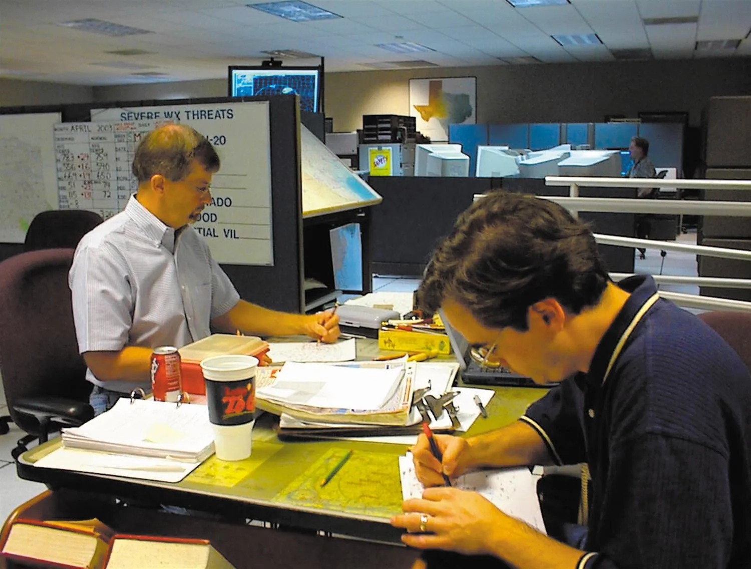
Come on in and pull up a chair. From time to time when I worked the forecast desk I used to get curious pilots wandering in with questions. Usually it was a B-1B Lancer crewmember who was delayed by a crowd of other pilots at the base operations counter. Since the weather station was 20 feet away it provided them with an opportune time to get all those questions answered that popped up at 30,000 feet.
One of the more interesting questions I’ve occasionally had is about our charts. Not what the markings mean, but what do we see? What are we thinking when we look at those charts? While there’s no way we can cover all the basics in this article, one thing I can do is walk you through a chart sequence and explain how it all comes together. The basics aren’t really that difficult so I’m confident you can learn a few things too.
Working From an Example
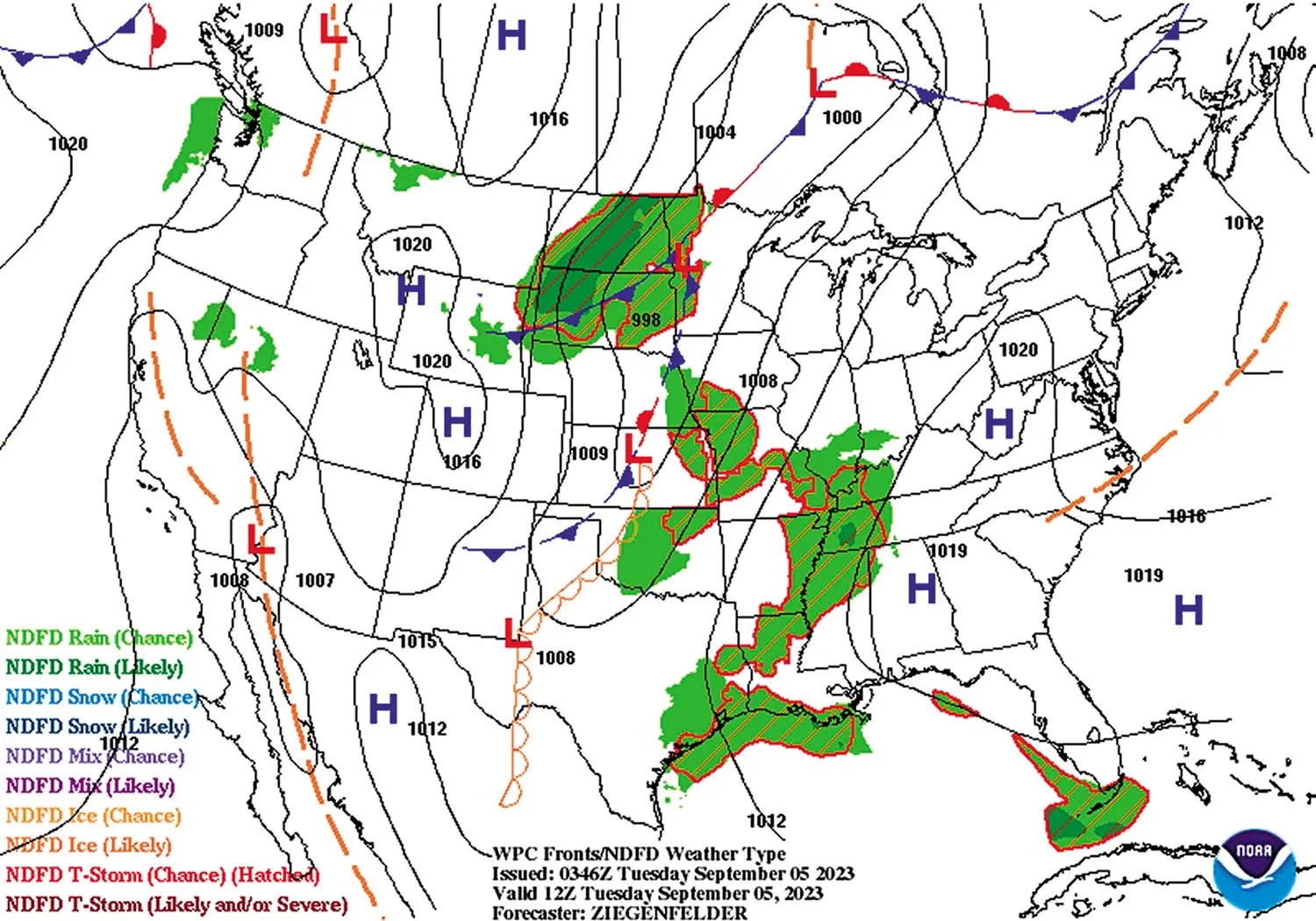
Let’s refer to a standard aviation prognosis chart. Charts like this are on the Aviation Weather Center website, under the tabs “Weather > Forecasts” and “Products > SIGMET.” Using this example I’ll show you just how much information can be extracted from this simple chart, using weather basics and geography. I’ll break it down in the order of things that I see, so that you can follow along and see exactly how a forecaster deconstructs a chart.
Naturally we’re all human so we’re drawn to the bright shiny things. My eye is drawn to the Northern Plains, where colors and patterns seem to stack up. This always means something interesting. The pastel colors indicate AIRMETs (the large shape) and MVFR and IFR conditions (the grainy blue and red colors, respectively).
The wind barbs tell us that there’s a punch of Canadian air heading southward. Remember that the wind barb shaft always points into the wind (vectors point away) and indicates the 1-minute or 10-minute average wind speed. Each long black feather indicates 10 knots of wind and each short one represents five knots.
Gusts are added to these wind barbs in red. This is a relatively new scheme entering widespread use that I never saw professionally before 2010, so many readers may be unfamiliar with it. To obtain sustained winds, look at the black color only and read the feathers. To obtain the gusts, visually combine the black and red together as one color, and read the feathers. For example, look at the wind barb on the North and South Dakota boundary just to the right of the green triangular “shower” symbol. This shows a sustained wind of 25 knots with gusts to 35 knots. So you’ll definitely want to be checking the crosswind components if you’re flying into that region.
We find numerous symbols for thunderstorms across Minnesota and the Dakotas, with the green shower triangles further to the west. The color of the thunderstorm symbol reveals the amount of coverage: darker symbols are scattered to numerous. Clearly there’s a lot of weather happening in this area.
In Montana and North Dakota we find icons for smoke and haze. These consist of the wavy pennant symbol and the infinity symbol, respectively. At the time of this map, early September, Canadian wildfires had been raging for months, and some of the smoke was transported south by the winds. During much of the summer the smoke was bottled up in Canada and the northern-tier states, but the strong cold fronts that we see in the fall months can easily propel this smoke deep into the United States.
My eye is also drawn to the area of storms in the Lower Mississippi River valley. These could consist of anything ranging from numerous individual thunderstorm cells, like air mass storms, all the way to an organized mesoscale convective system (MCS). There’s no way to know given the limited information on this map. But the large extent of this area is indicative of some sort of front or disturbance working on this region.
With all the good stuff out of the way, I begin pattern work—not the practice landings, but piecing together how the air masses and flows are set up. A large region of southerly flow (air flowing south to north) covers much of the South and Midwest. This is always an indicator of warm advection and moisture return from the Gulf of Mexico. Low-level warm advection is always a destabilizing process, and the stronger the winds, the stronger this destabilization is.
Part of this is due to differential advection. When you bring warm tropical surface air north to the Arctic, you have a dramatic “cold over warm” situation, which any weather guidebook will tell you represents instability.
Part of it is also due to dynamic effects like isentropic lift. When warm air is replacing cooler air that was already in place, it must rise to conserve its potential temperature. In summertime this effect is weak and is overwhelmed by surface heating, but in the cool season this is what gives us the so-called “overrunning” north of warm fronts. The tornado outbreak in December 2021 that tore through Kentucky and destroyed Mayfield occurred in a storm that initially developed in a zone of this kind of isentropic lift.
Understanding Air Masses
Let’s keep going. Deep southerly flow from the Gulf indicates a moist tropical air mass. Meanwhile the northerly flow in the Great Plains suggests a cold Canadian polar air mass is moving southward. In meteorology these air masses have a more formal name, using the Bergeron air-mass classification scheme. The Gulf of Mexico air mass is called maritime tropical, or “mT” air, while the Canadian air mass is called continental polar, or “cP” air.
Not all forecasters use these descriptors, and some consider them outdated in the era of digital forecasting, but you will see them from time to time if you start reading any sort of forecast discussions. Personally I find them a very useful way to categorize air masses, though I avoid rigid definitions. You’ll see many of the maps on my YouTube channel marked with them.
And of course there’s the dividing line between tropical and polar air. You can see this on the map as a strong wind shift, along a line from Minnesota to central Kansas to the Texas Panhandle. This marks a strong shear line corresponding to the cold front. Technically density (i.e. temperature) is what really marks the location of the front, but since we only have wind data here, the shear line is our best guess for the front. Besides, a northwesterly wind gusting to 30 knots in west Kansas almost certainly means a cold front has blown through.
As we further look around the map we see some light northerly flow in the Northeast states. This often corresponds to the remnants of an old polar air mass that is slowly modifying. In this particular case, looks are deceiving. There was no polar air because of hot conditions in Ontario and Quebec, and places like Rochester and Williamsport had risen to 90 degrees in the afternoon. In late fall, wintertime, and early spring, though, you’ll almost always win the bet that northerly flow is associated with cold air.
This swirl of air masses across the eastern states then brings my eye to the center of the circulation: southeast Alabama, where the wind shows a clockwise swirl. This is an anticyclone, or high pressure area. Good weather is very likely here, though with light winds there will be morning fog if any moisture is on the ground.
Looking across the western United States we find weaker winds. Do they resolve into a circulation? Look around and try to find places where winds are blowing away from, and where they seem to be blowing toward. Drawing streamlines on the map can be helpful. We do see that winds are converging in the southeast California desert. This probably marks the center of a thermal trough or heat low. Another low can be found in northern California, though the exact position isn’t clear.
We also see that air seems to be flowing away from western Colorado and southwest Wyoming. This probably corresponds to a weak “plateau high,” which often forms due to strong radiational cooling over the higher plateau regions. Much like the thermal trough it’s a semi-permanent feature. It strengthens whenever cold polar air floods into the Rocky Mountain region.
What else is noteworthy on the chart? Along the west coast we see strong northerly flow just offshore. This indicates the presence of cool polar air, or a maritime polar (“mP”) air mass with an origin in the higher latitudes of the northern Pacific. Depending on the weather pattern this air can be driven inland into the western United States. A good indicator that this is happening is strong northwesterly flow in the San Joaquin Valley of central California, with sustained winds of 10 to 20 knots. We don’t quite see that happening here, so the cold polar air has likely not come inland.
Applying the Basics
We now have a full workup of how air masses are moving around the United States, where the air masses are, and where some of the fronts are located. “But wait, there’s more!” as the TV pitchmen like to say.
Areas of strong offshore and onshore winds, particularly along oceanic coastlines and the Great Lakes, are all potent areas for weather depending on the season. During the summer, the waters are cool and the land is warm, while the situation is reversed in winter.
The most prominent example of onshore/offshore flow is along the Gulf coast, where we find southerly onshore flow. Since this map is for September we are in the tail end of summer, and this means slightly cooler air, though water temperatures of about 86 degrees F are fairly close to that of land. So we don’t find much significant weather, though the winds do bring in the moisture and can cause sea breezes.
During the winter though, water temperatures in the Gulf are close to 70 degrees F while land temperatures are closer to 50°F and can be much colder. What happens when we bring a warm, moist air mass over a cold surface? It cools from the bottom up through conduction, producing a stable warm-over-cold setup. In some cases the ground temperature is colder than the dew point temperature in the moisture return, leading to the development of stratus and advection fog. This is a significant source of IMC during the cold season in the southeast region.
Let’s flip it around and look at offshore flow, when winds are flowing from north to south in the Gulf. In the wintertime this not only brings cool air from the land over the waters, but the northerly flow is often driven by cold polar air masses. When the air hits the waters, the cold air picks up warmth and moisture from the bottom up. The layer is cold-over-warm, producing an unstable situation.
This results in extensive stratocumulus, gusty winds, and sometimes even cumulus and shallow cumulonimbus clouds. This all happens offshore, and the longer the fetch over the ocean, the denser the overcast and the more vertical the growth.
The Great Lakes are a prominent example where this kind of pattern happens in the winter. Cold Canadian air flows over relatively warm lake waters, producing destabilization, clouds, and lake-effect rain and snow. Where this air crosses back onto land, it gets the full brunt of whatever happened out in the lakes. This is why places like Cleveland, Erie, and Buffalo are often hit hard in the wintertime when there’s northwesterly or westerly flow. The Buffalo winter storm of December 2022 is a classic example of what can happen in the worst situations, where 52 inches of snow fell in five days.
Putting It Together
Now you have a better idea of some of the things forecasters look at when they pick up a chart. It starts with finding obvious trouble spots, looking at wind flow, identifying air masses, then using all this information to build up a picture of the weather processes taking place across the forecast area. We’ll look at some more examples of deconstructing charts in coming issues, so stay tuned.


