In our September 2018 issue, Luca Bencini-Tibo gave us an excellent introduction to Skew-T log-p diagrams. In this article I’ll give you a short refresher and help link all of this with actual weather situations you might see.
The Skew-T log-p diagram, typically just called a “Skew-T,” is an amazing tool for understanding what’s happening in the atmosphere at a given station. They are essential for understanding a precipitation regime or differentiating icing layers. Even after nearly three decades in meteorology I would find it almost impossible to understand an icing situation without this tool, and I often visualize the makeup of an environment with a sort of mental Skew-T image. I can’t underscore how valuable these diagrams are once you get to know them.
Skew-Ts are also very easy to find online. Advanced pilots and VFR flyers alike will all benefit enormously from learning how to work these into the flight planning process. I probably wouldn’t bother with them if I flew at jet altitudes, where the atmosphere is highly stratified and turbulence and storms are the main problems, but they can still be helpful for getting a quick look at what exactly you’ll be punching through during climb and descent, especially near major weather systems.
The Basics
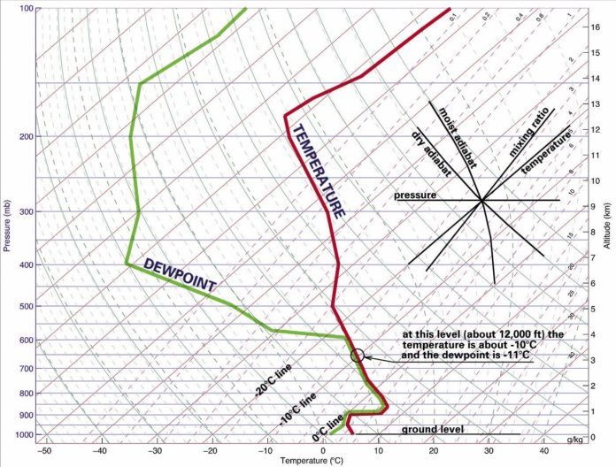
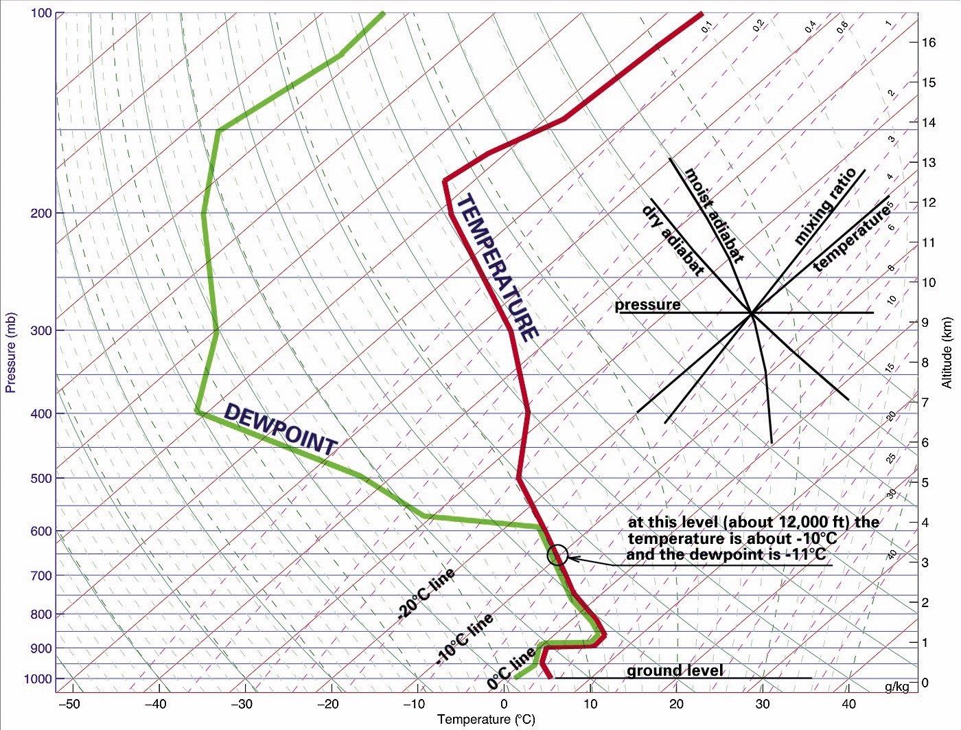
The Skew-T is actually quite simple. It’s a line graph where temperature is represented by the x-axis, and height by the y-axis. The diagram was developed in 1947 by the Norwegian meteorologist Nicolai Herlofson (not to be confused with a different Nicolai Herlofson whose pyramid schemes caused a Norwegian bank collapse in 1886). The Skew-T was adopted by the U.S. Air Force in the 1950s and became the most common format for showing upper-air data.
Temperature naturally drops with height due to the decrease in pressure, which in turn reduces the temperature, much in the same way a spray can gets cold when you spray the contents and the pressure inside decreases.
On average, temperature readings in the atmosphere at a given station, start out near 20 degrees C at the surface and fall rapidly to -40 near the tropopause. If we plotted this on standard rectangular graph paper, temperature plots would always slope sharply upward and to the left with height. But this makes it difficult for forecasters to see subtle changes in temperature layers. So the Skew-T is like graph paper where the vertical lines are diagonal, sloping up and to the right. When we plot temperature data this way, the line stands more vertically. This is why we call the diagram a “Skew-T.”
This diagonal format makes the graph a little trickier to read, but it’s not that complicated. Moving left to right on the diagram still indicates warming like we expect along the x-axis, and moving from bottom to top along the y-axis shows not only increasing height but also the natural cooling we see in the atmosphere every day.
Since the Skew-T is calibrated by pressure in millibars, not by altitude, it’s important to know some basic equivalents so you can ballpark what you see. The second-to-bottom line is almost always 1000 mb, about 300 feet MSL in a standard atmosphere. The topmost line is usually 100 mb, about 53,000 feet MSL. In between, some good equivalents to know are 850 mb (5000 feet), 700 mb (10,000 feet), and 300 mb (30,000 feet MSL). Of course, these altitudes fluctuate based on conditions. In general, the actual heights will be about three percent higher for each 10 degrees Celsius above ISA (standard) temperature.
You will often hear “Skew-T” and “sounding” used interchangeably. However “Skew-T” refers more to the chart format, while “sounding” refers to any atmospheric diagram (such as the Skew-T) together with the plotted data for a given station. It’s acceptable to call a completed diagram a Skew-T, but in meteorological literature and in discussion we normally call it a “sounding,” and that’s what we’ll do here.
What It Displays
The sounding has two main components you should know: environmental data and parcel data. Environmental data simply shows the actual, observed readings of temperature and dewpoint, as reported from weather balloons. You’ll normally see this displayed as a jagged line. All the temperature spot readings are connected upward in dot-to-dot fashion, as is the dewpoint. Temperature is always the right-hand line, and dewpoint is to the left. If the hygrometer fails or the humidity is too low to observe, the dewpoint line is omitted. This is common in the upper troposphere.
A third line is sometimes drawn. Parcel data represents hypothetical conditions for convective updrafts. A parcel is any arbitrary mass of air about the size of a cardboard box. Not all soundings show parcel data. It can be drawn manually using parcel lift techniques, or automatically on sounding websites. It is distinctly identified by a long line that starts near the environmental temperature line at the bottom of the chart and curves up and to the left.
This is not actual observed data, but gives an approximation of parcel temperature within a growing cumulus or cumulonimbus cloud. Don’t worry too much about it, but as a rule when it falls to the left of the temperature line, it suggests that lifted parcels are colder and the atmosphere does not support showers and storms, and vice versa when it falls to the right.
Desert Weather
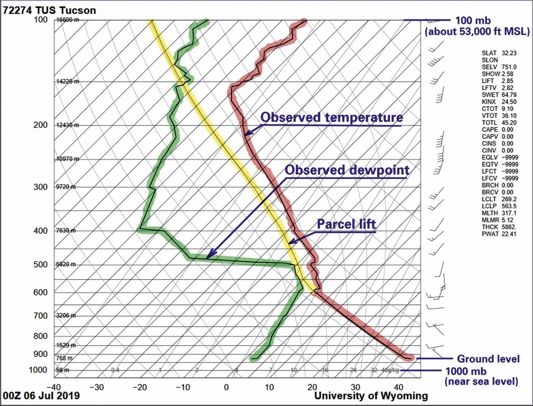
Let’s look at some actual examples starting with a summertime sounding in Tucson, Arizona. Note the date and time to know you have current data and see the time of day: a morning atmosphere is much different from an afternoon atmosphere. Since the time shows 00Z in Arizona, we know this is late afternoon.
We can see that the surface temperatures, represented by the bottom of the environmental temperature line (red), are extremely warm. Reading this value against the temperature grid lines, we see that the surface temperature is about 39 degrees C. That’s definitely going to mean some high density altitudes.
Now follow the temperature line upward. Up to the 600 mb level, the line almost perfectly follows a set of curved grid lines sloping up and to the left. These are dry adiabats, representing potential temperature lines. Potential temperature is the temperature a parcel would have if it was moved to the 1000 mb level, near the surface. By reading temperatures against these lines, we remove the effect of adiabatic temperature changes.
Because the temperature line follows these grid lines, forecasters often refer to these as “dry adiabatic layers.” This is almost always a strong indicator of surface heating, powerful thermals, and gusty winds throughout the depth of this layer. In this case the layer tops out at 600 mb, about 14,000 feet MSL. You’re going to get bounced around flying through this environment, and if there are strong upper-level winds, it’s safe to expect strong turbulence.
Above that we see a second layer where the temperature line changes slope. The temperature line no longer follows the dry adiabat, and here the air has a higher potential temperature. This represents a weak inversion. Since the dewpoint line (green) is close to the temperature line, the humidity is high in this layer and there’s a good chance of cloud material. A general rule is when the two lines are within 5 Celsius degrees of each other, clouds are likely.
What we are likely seeing is a layer of elevated moisture and latent heat deposited by storms that develop every afternoon over the mountains. Because the temperature line doesn’t slope so sharply up and to the left, this layer is more stable and will give a smoother ride outside the clouds. So you know that the turbulence will decrease as you climb above 14,000 feet. This dry adiabatic layer will deepen during the day, however.
Above that is a third layer starting at 500 mb (about 18,000 feet MSL). The temperature line shows a slight jag to the right, and more significantly the dewpoint line goes far to the left. This indicates a dry layer, most likely part of a subsidence inversion caused by dynamically-induced sinking within an upper-level high-pressure area. Since the two lines are far apart, the air is quite dry and visibility will be easily 100 miles. This layer probably lacks clouds.
The parcel line (yellow) isn’t particularly important, but since it falls to the left of the temperature line, we can cautiously assume that the atmosphere is stable and precipitation is unlikely. However such parcels are calculated using automated algorithms and may not be representative of the actual environment, especially where there’s elevated moisture as shown here. Also changes in the upper levels over time or poor sampling can make the parcels more or less stable than we would otherwise expect. A general rule is if the parcel line mostly falls on top of the temperature line through a deep layer or falls to its right, the atmosphere is probably unstable and will support storms. Another rule is the atmosphere is often a little more unstable than the diagram suggests, rather than more stable.
Let’s not forget the wind barbs. Note that the winds are flowing west-to-east in the lower levels and south-to-north in the upper levels. Remember Buys Ballot’s Law from ground school? With the wind at your back, low pressure is toward your left. This tells us that in the lower levels, there’s probably a thermal low, or heat low, northwest of Tucson, maybe near Phoenix. In the upper levels, high pressure aloft is almost always associated with fair weather and VMC. These highs also coincide with areas of unusually hot weather, especially when they are indicated to your east, west, or north. Since in this case high pressure is indicated to the east, we can assume there’s probably fair and hot weather somewhere in New Mexico or Texas.
That’s a ton of useful information right there, before we even call for our weather briefing.
The Tropics
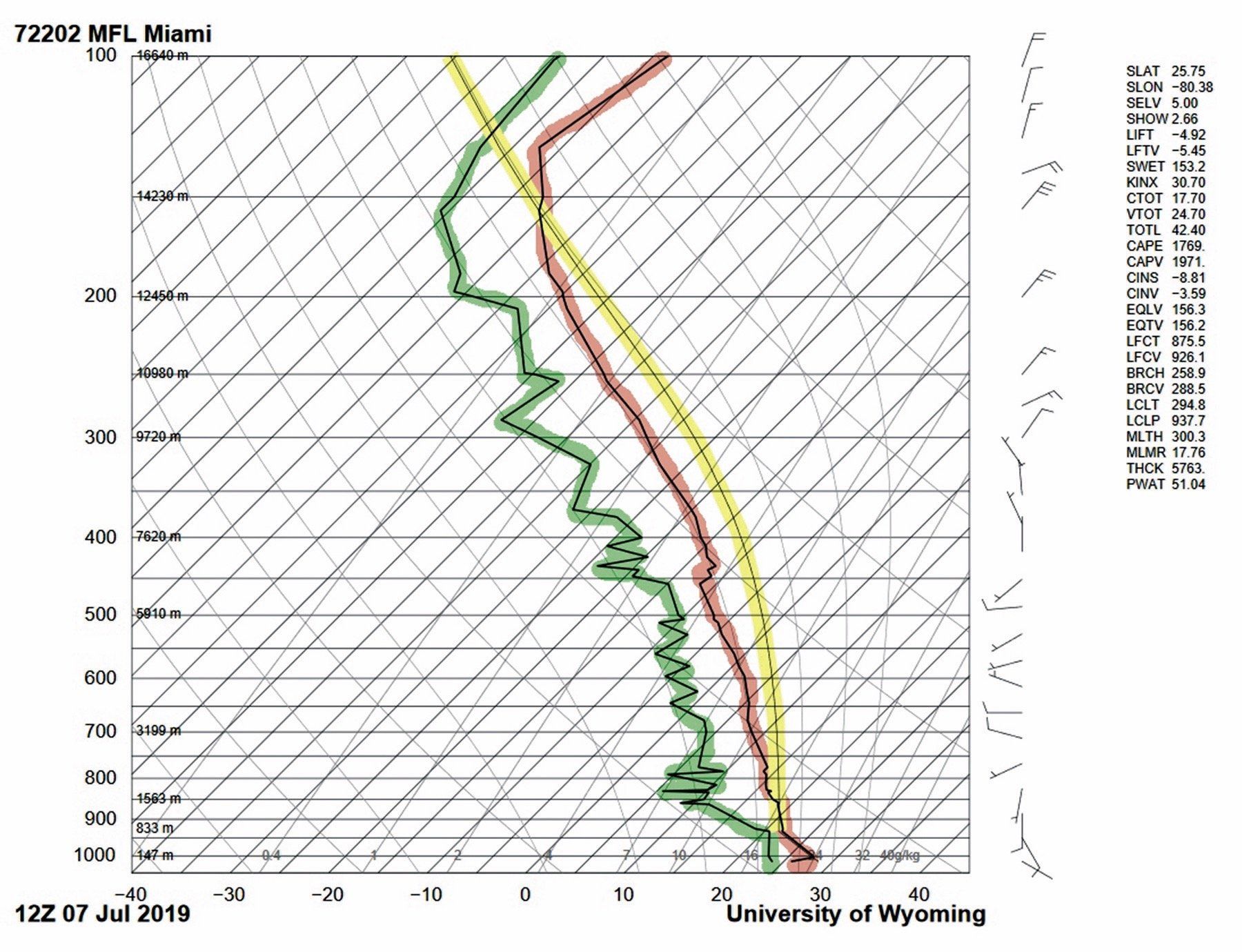
Let’s shift gears a bit and look at a summer sounding for Miami, Florida. Looks quite a bit different from Tucson, doesn’t it? Did you spot the change in the time? In this case we presented a 12Z sounding. This is 8 a.m. in Florida, so morning heating hasn’t yet begun and except for a thin layer near the surface, the atmosphere is mostly made up of leftovers from the previous night.
Notice that the sounding stands just a little more upright, in other words, it leans somewhat more upward and to the right, compared to the Tucson sounding. This indicates that the atmosphere has a weaker lapse rate, and any thermals are probably weaker.
The dewpoint line (green) also remains close to the temperature line (red), illustrating much higher relative humidity. They come within five Celsius degrees of each other through many parts of the sounding, so this is a clue that there are probably numerous cloud layers. Most of this moisture is made up of evaporated water from surrounding oceans and wetlands, and from residual moisture from showers from the previous evening.
One thing that’s quite significant is the lifted parcel line (yellow) sits to the right of the temperature line. This is a very important indication, and since the parcel line is more likely to underestimate instability, this sounding presents clear indications of instability and thunderstorms later in the day.
How about icing? We can definitely get that in the summertime. If the atmosphere supports precipitation, the 0 to -10 degree C layer is most likely to have clear icing with large drops. This sounding shows we will find this between 570 and 460 mb. If we use an online calculator (search for ISA pressure calculator) we see that this falls between 16,000 and 22,000 ft. So where poor weather exists, it’s definitely advisable to cruise a little higher or lower. You can also use the parcel line to get an idea of icing layers within a strong updraft; these will be a little higher due to the addition of latent heat.
And finally we look at the winds. We see a light and variable southwest wind in the lower and middle levels, and a northerly wind in the upper levels. This suggests a weak surface high to the southeast, and ridging aloft to the west or northwest. We can be reasonably certain there’s some good VFR to be found in the Gulf of Mexico.
Don’t Stop Here
As with any skill, your interpretation of the Skew-T diagrams will improve with practice. Being able to read soundings will not only help you quickly size up the situation at your destination, but it will also let you understand meteorological papers should you ever stumble across them on the Internet. The vast majority of forecast reviews and even some NTSB accident reports include relevant soundings.
To start looking at soundings, visitweather.rap.ucar.edu/upper. orweather.uwyo.edu/upperair/sounding.html. The second website allows you to also see historical soundings going back to 1973. This can be useful for looking up those memorable weather situations that added a few gray hairs, and help keep you from adding to the collection.
Tim Vasquez is a former Air Force meteorologist who still remembers the days of having to hand-plot a sounding in ten minutes from coded teleprinter data. He gladly leaves this job to the computers these days.
